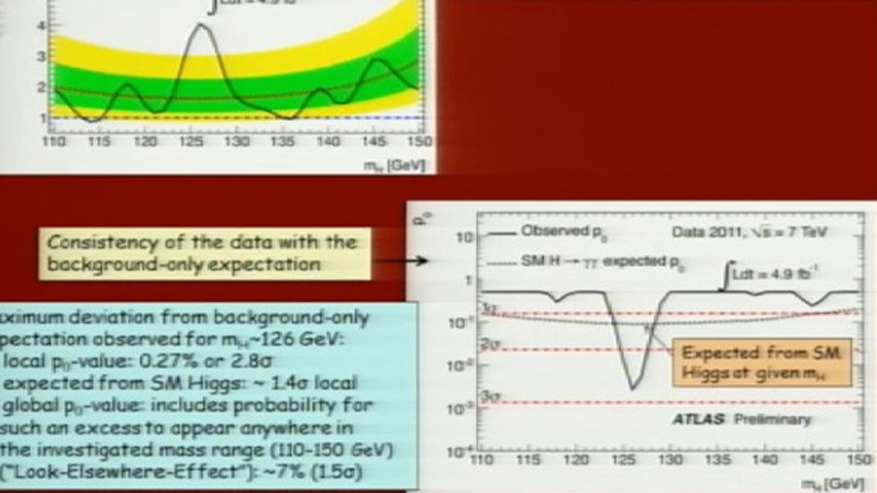
After scientists announced the strongest evidence yet of the elusive “God particle,” typography nerds raged on Twitter that researchers had presented their findings in Comic Sans -- essentially “the equivalent of showing up to the office in flip-flops.”
The font, so hated that there’s a movement calling for its demise, nearly threatened to overshadow the discovery itself: that researchers at the European Centre for Nuclear Research had found evidence of the Higgs boson, the subatomic particle believed to form the basis for the entire universe.
“They used ComicSans on the Higgs Boson powerpoint presentation... Nope there is no hope for mankind,” @CosminTRG said.
“ComicSans is the equivalent of showing up to the office in flip-flops,” tweeted user @Linotype_com. “Very friendly and casual, but is it appropriate?”
If you're a font nerd, and I fall into the fringe of font nerdery, CERN's use of comic sans in their slides for Higgs Boson is a crime.
— Adam Tupper (@AdamAJTupper) July 4, 2012
Comic Sans was designed in 1994 by Microsoft designer Vincent Connare, who was looking for a font akin to those used in comic books that would be appropriate for dialogue balloons over cartoon characters.
The font was included in Microsoft programs such as 3D Movie Maker before making its way into a version of Windows 95 and Microsoft Publisher.
The backlash was swift, with the font panned by an angry and devoted non-fan base of graphic designers the world over.
Leading the charge are artists David and Holly Combs, whose 10-year-old “ban comic sans” movement -- which includes the pithy catchphrase “putting the sans in comic sans” -- includes a petition to have the font scrapped from Gmail.
In a manifesto published to the campaign’s website, the pair uses a “Do Not Enter” sign as an example of the inappropriate use of the font.
“Clearly, Comic Sans as a voice conveys silliness, childish naivete, irreverence, and is far too casual for such a purpose. It is analogous to showing up for a black tie event in a clown costume,” the manifesto reads.
“We are summoning forth the proletariat around the globe to aid us in this revolution. We call on the common man to rise up in revolt against this evil of typographical ignorance.”
The CERN scientists aren’t the first public figures to come under fire for public use of the font.
Back in 2010, Dan Gilbert, owner of the NBA’s Cleveland Cavaliers, was roundly criticized for using Comic Sans in a rant he posted online about the loss of star player LeBron James to the Miami Heat.
MC Siegler wrote on TechCrunch that the use of Comic Sans essentially undermined Gilbert’s intention, which was to show how angry he was at James’ defection.
“Normally a staple among six-year olds and grandmothers, Gilbert for some reason decided to use the font to write what will undoubtedly be the most public message he will ever write," Siegler said. "And it's too bad, because the content of the message itself is quite good -- very juicy.
While Gilbert was universally criticized, the CERN scientists do have their defenders.
“Everyone complaining that the Higgs Boson slides had ComicSans in them can shut up and go find their own fundamental particle,” tweeted @mhoye.
I love that the Higgs-Boson presentation was in Comic Sans. Science laughs at your desire for order and purpose. Chaos everywhere!
— Frank Chimero (@fchimero) July 4, 2012
Whether the CERN team was making a joke that got lost in translation is unclear.
But what is certain is that while Comic Sans may be hard on the eyes of design experts, it does appear to have some fans, including people who suffer from dyslexia. The font’s defined letter shapes, such as long stems on letters “b” and “p,” are easier to read, and have inspired a similar font for dyslexics called “Lexia Readable.”
If Marshall McLuhan taught us that the medium is the message, then Twitter user @EvilllMi reminds us that sometimes no matter what medium is used, the message may not get through at all:
Whether it was Comic Sans or Wingdings, I wouldn't have understood anything on the presentation anyway. #Higgs #ScientificallyChallenged
— Mi Mai (@EvilllMi) July 4, 2012


