Let’s go back to March, 2020. That sentence is nightmare fuel for most people.
The entire globe was shutting down as COVID-19 spread. There was intense fear and uncertainty as people became sick. What used to be an innocuous trip to the grocery store unleashed a wave of anxiety over becoming infected, and spreading the disease to others.
And it felt impossible to keep up with the number of confirmed cases, as they climbed globally.
That’s when a data tool emerged out of Johns Hopkins University in Baltimore that provided comprehensive and visual up-to-date information on global case counts and deaths due to COVID-19.
The COVID-19 dashboard was first launched in January 2020 and tracked confirmed cases globally. It was created and run by academics at the university at a time when countries like the U.S. had a mere 245 confirmed cases. It provided crucial, easily accessible information to the world’s population. Everyone from major news outlets to households relied on the dashboard.
Nearly three years later, the Johns Hopkins Coronavirus Resource Centre announced the site would be shuttering on March 10, 2023.
As other organizations, such as the U.S. Centers for Disease Control and Prevention (CDC), have launched their own tools, it was decided the dashboard should come to a close.
“It is still the only place right now where you can get the full global account of what’s going on with the pandemic,” said Beth Blauer, the associate vice provost for public sector innovation at Johns Hopkins. “It is a bittersweet moment, but the institutions that have emerged around it and the processes are improving to the point where it’s making less and less sense for us to keep on doing it."
Blauer joined the COVID-19 dashboard team near the end of February 2020 to improve the front-end experience and to make the data more accessible for public consumption, she told CTVNews.ca in a phone interview Friday.
The site was created by Prof. Lauren Gardner from the department of civil and systems engineering at Johns Hopkins Whiting School of Engineering, in January of 2020.
The dashboard is also run entirely by female academics, said Blauer.
HOW THE TRACKER CAME TO BE
Blauer and the other researchers were determining how they wanted to spend their time during the pandemic, and realized public data about COVID-19 could be communicated to the public in an urgent, efficient way.
“We realized, this is what we could do to help. We rolled up our sleeves and started to think of ways of visualizing the data,” she said. “And also to help navigate the information landscape that was starting to feel very confusing.”
Data about the pandemic was consistently needed, from governments making decisions about lockdowns, to individuals making daily decisions about how to behave.
The CDC did not have an equivalent dashboard and neither did the World Health Organization. In Canada, the Public Health Agency of Canada was providing case count updates.
Conflicting information was also emerging, from public health experts to armchair epidemiologists, said Blauer. “Another thing we were trying to do is pull the data into a space that allowed it to be contextualized by trusted public health experts. An academic institution is a great place for this…we are committed to upholding the core values of research,” she said.
But Blauer never imagined the site would be so relied upon. It hit a billion views in January 2021.
“It’s staggering. It was a stunning moment, it also confirmed this notion that people were seeking that trusted voice,” she said.
BILLIONS OF VIEWS
Now, the site has more than 2.5 billion views, she said. There have also been more than 200 billion tracked uses of the data through online embedding.The information is open and anyone can embed it when needed, which was a deliberate decision, said Blauer.
“We felt very strongly it was a public good. A lot of systems have been drawing out of our API (application programming interface), the data, whether that’s for research, modelling…all the different places it’s gone,” she said.
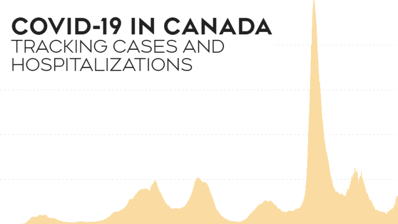
In Canada, PHAC continues to provide weekly updates on case counts, hospitalizations, deaths and vaccination rates in the country. It also publishes a COVID-19 wastewater surveillance dashboard that is updated twice a week. Varied testing policies across the country mean that reported case counts could be lower than actual numbers, PHAC notes on its site.
Blauer feels governments have a great responsibility to continue to report consistent and accurate public data, and that’s not happening evenly across U.S. states, she said.
Overall, part of the legacy of the dashboard is highlighting how quickly and accurately academic institutions can be relied upon and the importance of retaining research institutions, she said.
The fact that the site was launched and maintained entirely by women, also emphasizes the need for more women in STEM, she added.
“They just have a different kind of focus and desire to make the world a better place, the more we can leverage this platform to encourage more women to pursue the field, the better."


